


Texas Border Business


By Jesse Ferrell, AccuWeather
I contributed to an article today that we’ve published entitled “Higher temperatures affect survival of new coronavirus.” I wanted to offer some additional data and maps here on my blog.
The weather map on which the researchers plotted the COVID-19 outbreaks is shown below.


What they were insinuating with the paper was that their cursory analysis showed that the biggest outbreaks of COVID-19 were located in similar temperature zones, and deserved further analysis. I believed they may have found a correlation but not causation, and that the data was not sound, so I wanted to investigate this further.
To start, I wanted to remove the weather data from the map. I asked myself: “Are the biggest outbreaks just happening at a consistent latitude because the largest populations live at those latitudes?” Below is a map I created with ESRI software that shows the most recent [estimated 2016] population map, with the data from the Johns Hopkins Coronavirus Board.
Rather than hand-analyzing where I believed the hotspots were with course circles, I restricted the gradient colors from dark red to light pink, to only look at more than 100, but less than 1,000 cases. This makes all the dots over 1,000 dark red. You could move that number up or down, but the data looks about the same. The point is, you are defining “outbreaks” statistically, not unempirically.

So what does the population map show? Most, but not all of the outbreak areas are in high population areas, but many highly populated areas such as India are showing no cases. So, my worry that we were just looking at coronavirus cases through a population lens was not founded. I would, however, like to see cases normalized for population, but that’s not data I have in front of me.
And now, on to the weather map. Their choice for the temperature data behind their annotations of the coronavirus hotspots was odd… it was the European Centre for Medium-Range Weather Forecasts’ ERA-Interim 1000mb average temperatures from November 2018 to March 2019.
Data from this particular “reanalysis” — an after-the-fact analysis of weather conditions, often used to filter out bad data and smooth lines — was only available through August 2019, so that’s why they didn’t use more recent data. I argued that it doesn’t make any statistical sense to plot this year’s coronavirus cases on last year’s temperatures. Instead, I would have preferred to see a long-term average of the temperature, which would not vary a lot from year to year. Here is an animation of the 2-meter (more commonly used in meteorology) 30-year average temperatures for each month.
The most important thing this animation show is that, if the virus is most prevalent in a narrow temperature zone, then it will move much farther north, out of populated areas by May or June. But is there really a meaningful correlation?
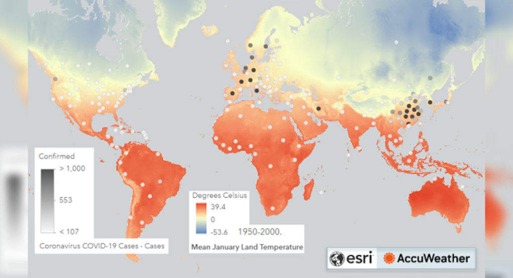
The only average weather data by month I was able to locate in ESRI’s “Living Atlas” database was for January. Here’s what that looks like with the COVID-19 hotspots plotted on top of it:
Is there a correlation here? Perhaps. Most of the outbreaks (darker circles) are within the same temperature band, about 0 to 10 degrees Celsius, but much of the U.S. and Eastern Europe (which haven’t shown large outbreaks) are also in that region. If you contract the temperature area more, you start to lose the China outbreaks. If it really was temperature, I’d like to see a higher correlation than that.
NOTE: These are my opinions only. There are a lot of facets not discussed in this blog entry, including the UV Index, seasonal and other factors. Most of those are addressed in our news story.
Jesse Ferrell AccuWeather Meteorologist and Social Media Manager. Jesse Ferrell covers extreme weather and the intersection of meteorology and social media.